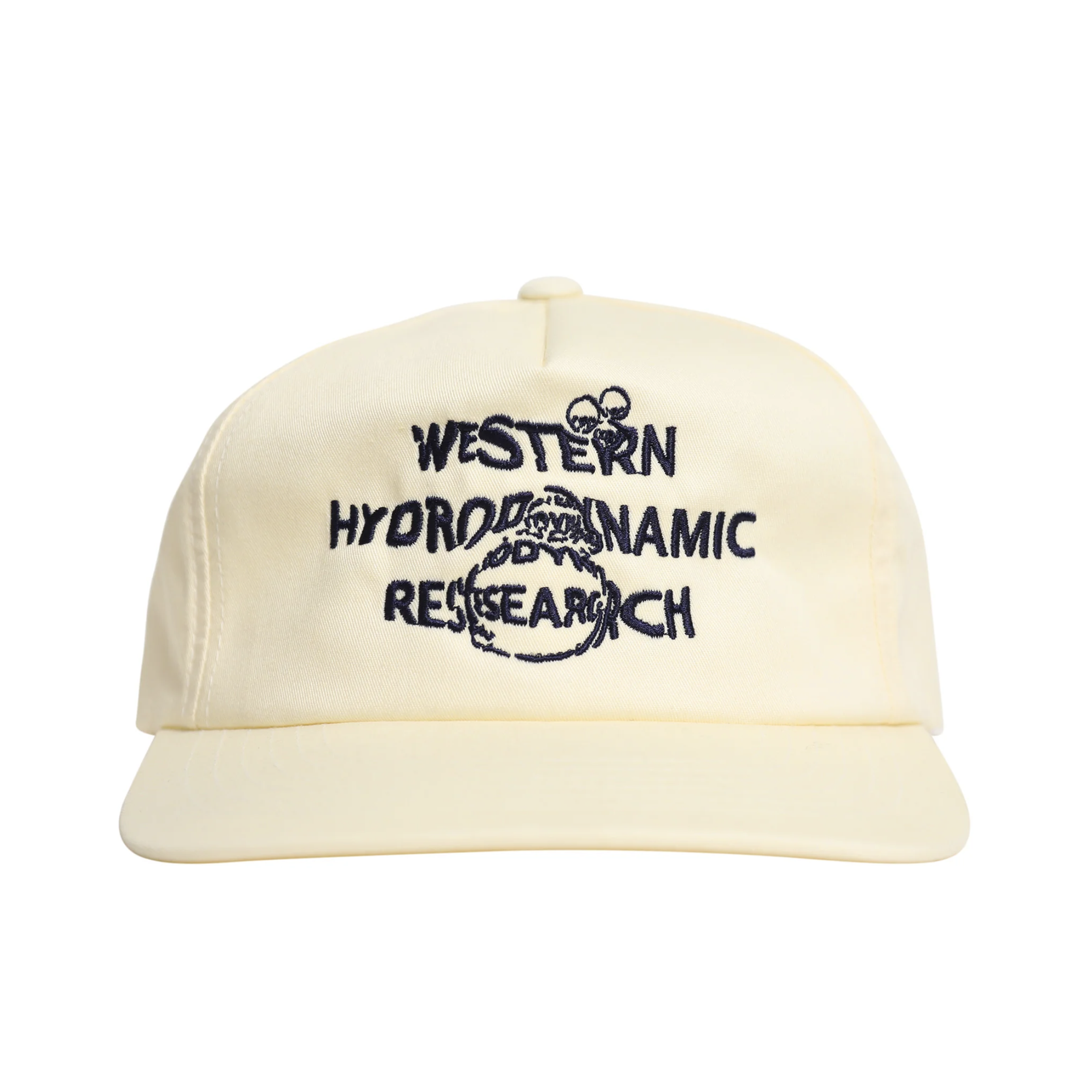
W.H.R.
Typography
02.20.24
I executed an analog typographic adaptation reflecting the aquatic-inspired brand identity of Western Hydrodynamic Research. This process seamlessly aligned with the brand's ethos, resulting in a cohesive and enriching material transformation.